Branding
Branding & Web design for Anvado
Anvado was a quick project with the goal of getting a foothold in the website development market and creating a simple brand identity.
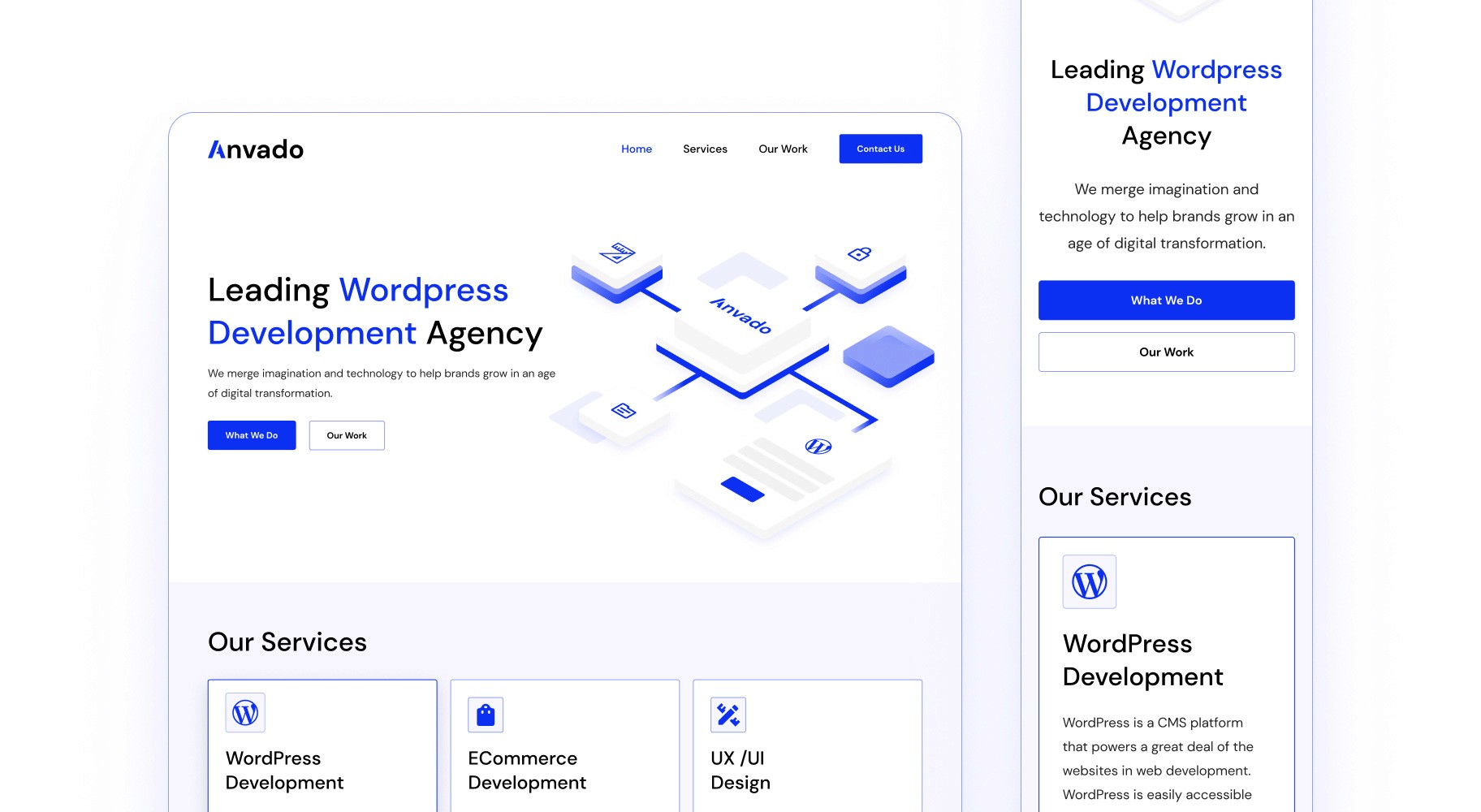
My job involved creating branding rules, designing a logo, working on the website's look, and making illustrations for the headers.
Project Details
Role
UI Designer
Industry / business
Website Development
Project duration
1 Month
Visual Style
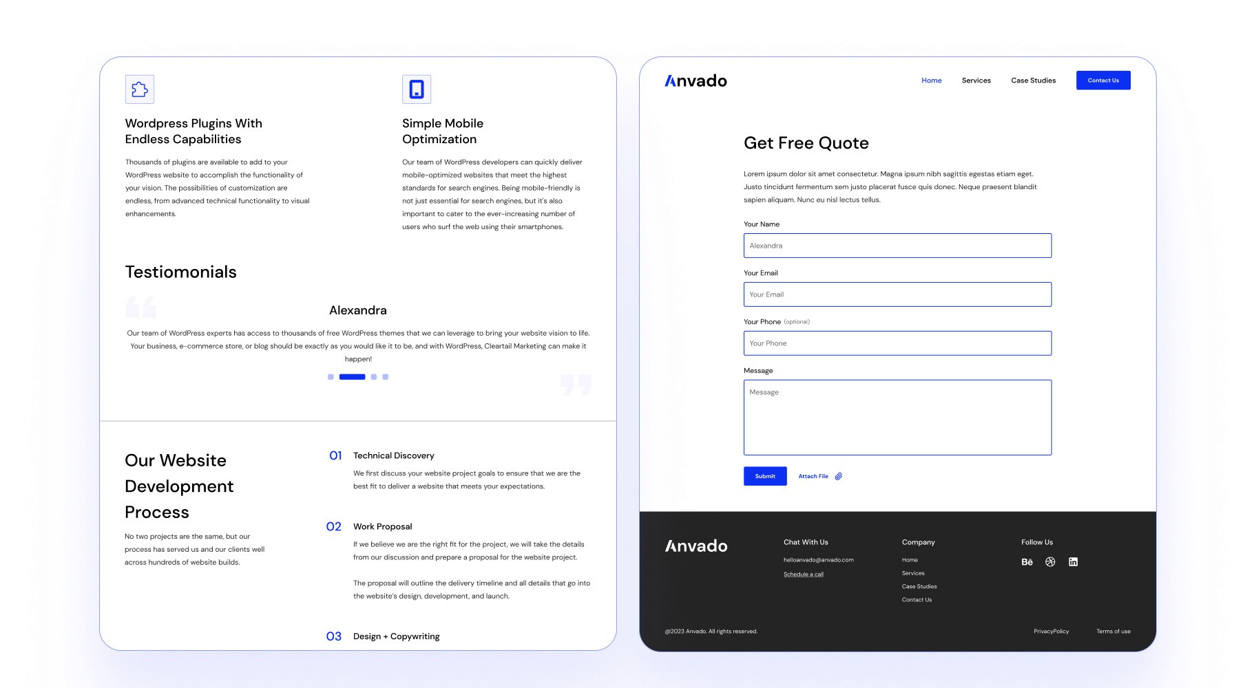
Anvado's primary goal was to showcase their website development services while making it easy for clients to contact or book their services. The site needed to function as a business card, offering a quick and effective way to convert visitors into customers.
To achieve this, we focused on creating a design that prioritized high conversion rates and performance optimization. The design had to be neutral and minimalistic, ensuring it didn’t distract from the variety of work showcased. This allowed the focus to stay on Anvado’s services without overwhelming the user with unnecessary design elements.
Logo Design
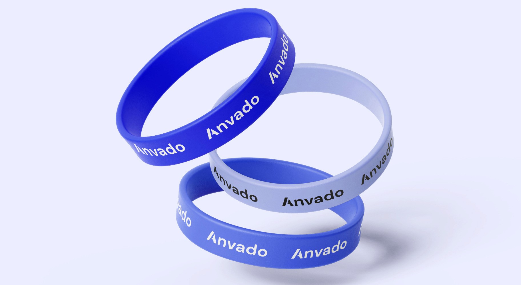
To kick off the design process, I focused on creating the logo for Anvado. This gave me a solid foundation for experimenting with different color schemes and typography. The aim was to design a clean, straightforward wordmark that reflects Anvado’s identity as a startup in the web development space. We wanted something simple yet professional, aligning with their brand values and capable of standing out without being too bold or complex.
Website Design
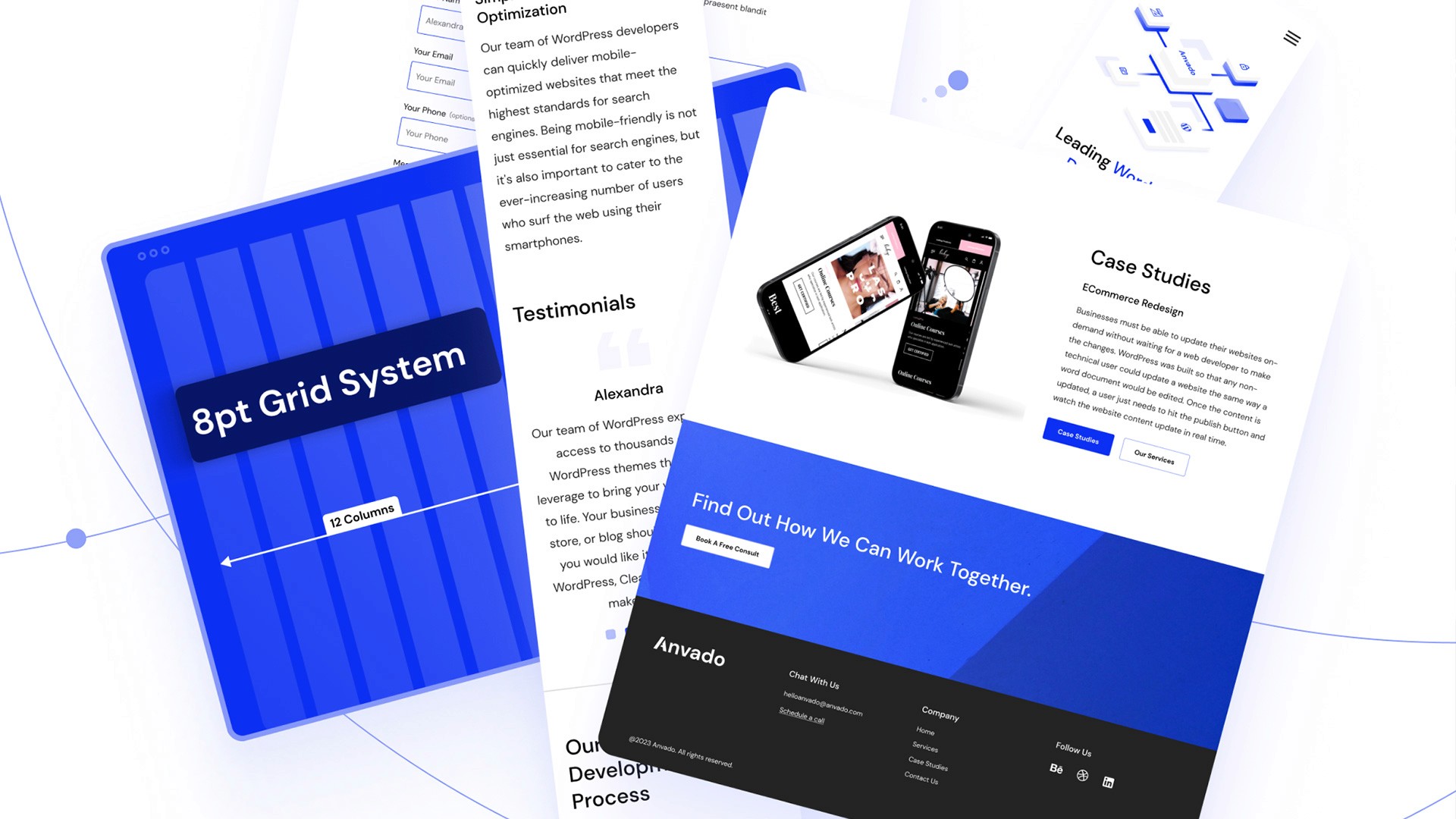
The design process started with creating several moodboards to explore different visual directions for the brand. After reviewing the options and discussing the overall feel we wanted for the website, we decided on a blue color scheme for the primary color. The blue provided a strong, professional tone that fit well with Anvado's brand identity. To balance this, we chose white and black as complementary colors, keeping the design clean and straightforward.
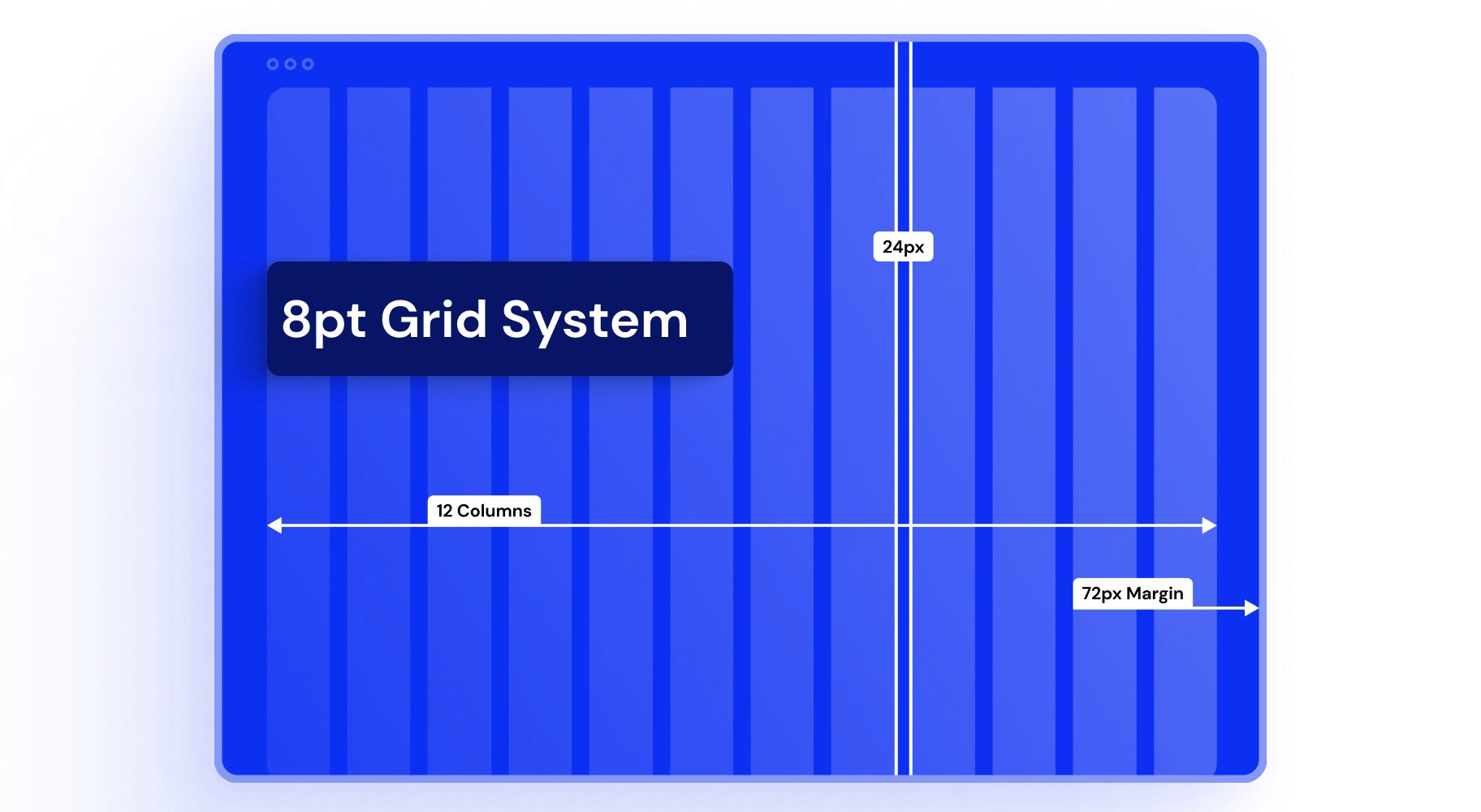
Once the color palette was settled, I moved on to defining the typography. Selecting the right fonts was crucial for creating a clear and readable experience across all devices. I focused on simplicity here as well, opting for a modern sans-serif font to match the minimal design. The grid layout was another key part of the process. I established a structure that would keep the site organized, ensuring consistency across different sections and making it easier for users to navigate.
For the spacing and typography scaling, I used the 8pt grid system. This system helped me maintain consistent spacing between elements and ensured that typography scaled properly across various screen sizes. By sticking to this grid, I could streamline the design process and ensure that the layout felt cohesive, whether viewed on desktop or mobile.
Each step was focused on functionality, clean aesthetics, and ease of use, with the ultimate goal of creating a user-friendly experience that would enhance Anvado’s online presence.
Illustration
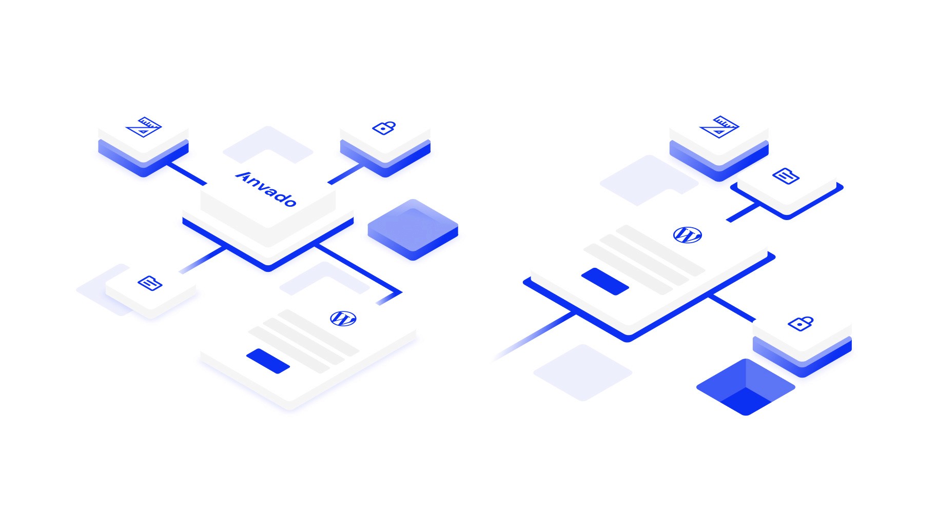
For the hero image, we wanted something that would grab attention but still fit with the overall flat design of the website. Using a stock photo didn’t feel right for this project, so we decided that a custom flat illustration would work better to match the minimalistic style.
With this in mind, I designed a simple vector illustration that visually represents the key services Anvado provides: security, organization, design, and development. The idea was to show that all of these elements come together under Anvado’s expertise. To make this clearer, I used icons to represent each concept and placed them on stacked blocks, mimicking the structure of a server.
Thank you
If you are interested in my work, please feel free to explore my other projects or contact me. Thank you for taking the time to explore this case study.
