E-Commerce
Blanche: Website design for teeth whitening products e-commerce website
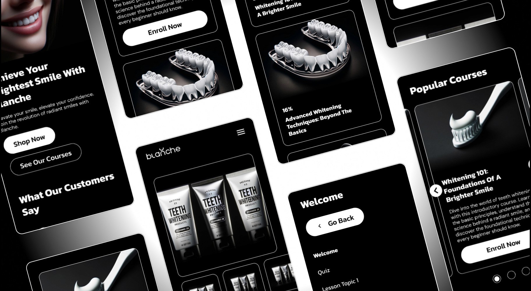
The Blanche project was a rapid e-commerce design initiative focusing on an intuitive and user-friendly interface for selling teeth whitening products. Our client required a quick demo to visualize the potential of an online platform dedicated to oral hygiene products, particularly teeth whiteners.
Project Details
Role
UI/UX Designer
Industry / business
E-Commerce
Project duration
75 Hours
Project Constraints
This project had strict time and device constraints to ensure a smooth user experience across all platforms. The primary limitations included:
A tight deadline of 72 hours to complete the entire design.
Compatibility across mobile, tablet, and desktop screens to ensure responsiveness and accessibility for all users.
Design Process
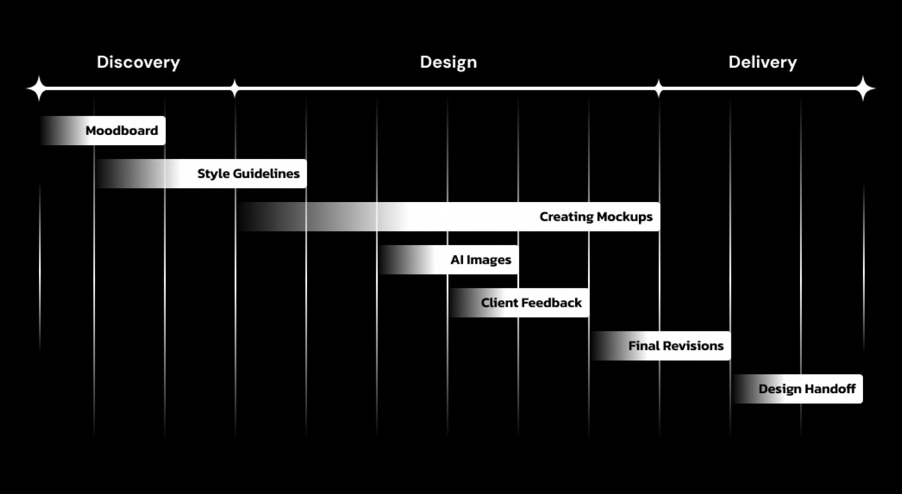
The design process followed a structured approach, broken down into three phases: discovery, design, and delivery. During the discovery phase, research and initial planning were conducted, followed by wireframing and visual prototyping in the design phase. The delivery phase involved the final visual designs and preparation for handoff to developers, ensuring all aspects were ready for implementation. The timeline was strictly adhered to, ensuring the project was completed on schedule.
AI Support
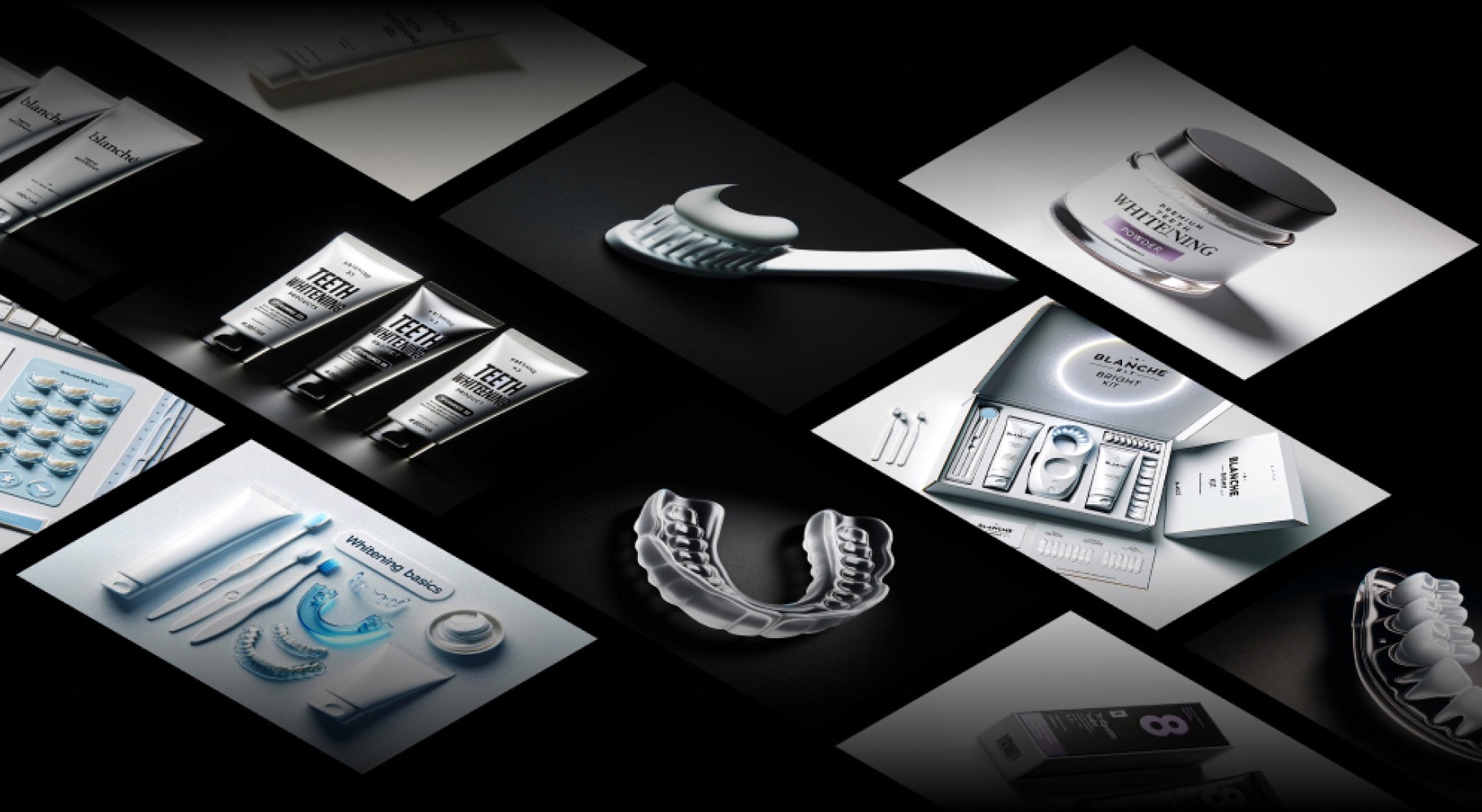
To enhance productivity and streamline the design process, AI-powered tools were used. These tools assisted in quickly generating design assets and improving efficiency without compromising quality. The use of AI also helped in maintaining design consistency, especially with repetitive elements and layouts.
Visual Design
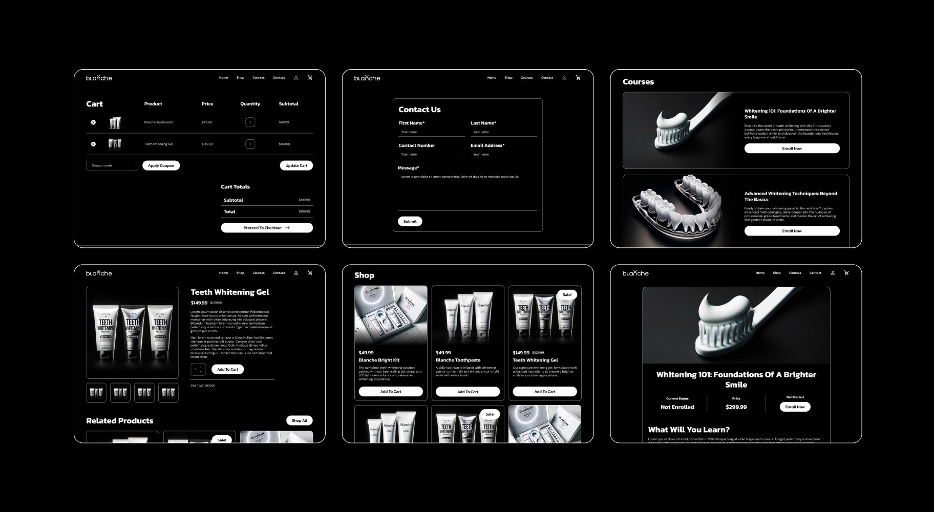
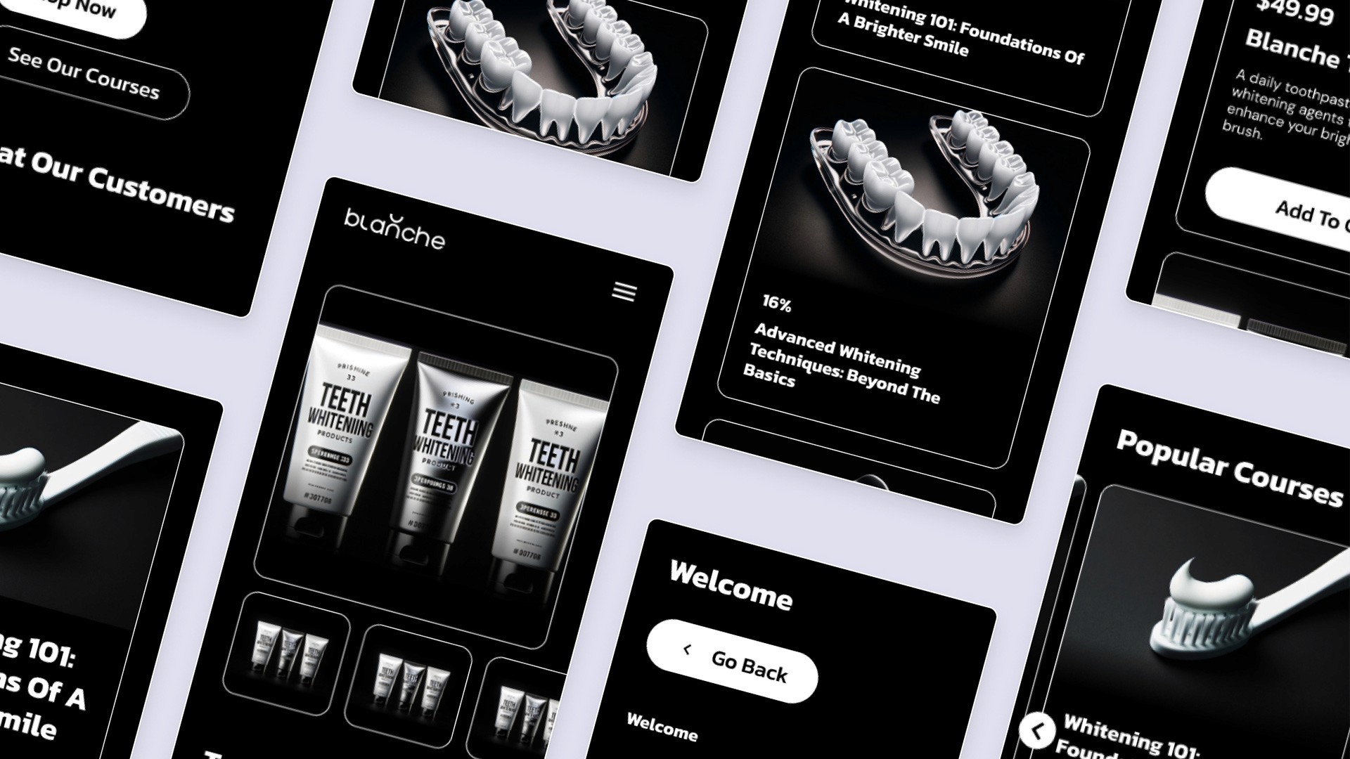
The visual design emphasizes a sleek and modern aesthetic that aligns with the brand’s focus on providing high-quality products. A dark color palette with high-contrast elements was employed to create a striking visual impact. Minimalist, bold typography and clean layouts enhanced readability and engagement. The design also features clear product displays, prominent CTAs, and a professional, polished look for optimal user interaction.
Along with the dark theme, the visual design was created to be both practical and visually appealing. The layout was clean and easy to navigate, ensuring that products were the main focus. High-quality images were used to show off the products, while simple icons and subtle animations helped guide the user without being distracting. We also used plenty of space between elements to make the content easy to read and digest. Overall, the design aimed to make the user’s experience smooth and enjoyable, while keeping things consistent with the brand’s look and feel.
Mobile Design
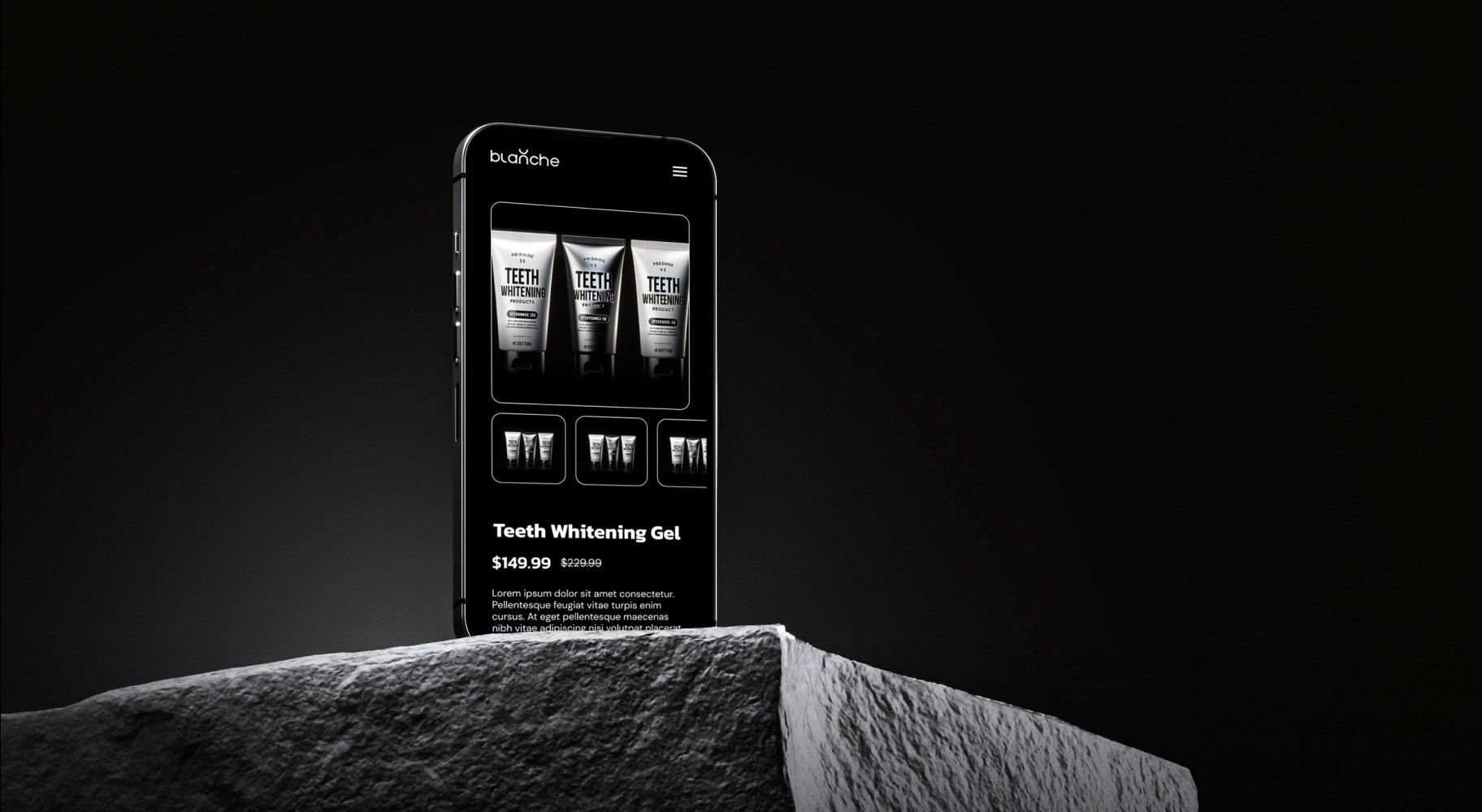
Given the increasing importance of mobile-first design, particular attention was paid to the mobile experience. The mobile design retained the same sleek and modern aesthetic while ensuring ease of navigation and usability on smaller screens. Key features, such as product listings, customer reviews, and course offerings, were optimized for mobile devices to provide a seamless browsing experience. The mobile interface incorporated responsive design principles, ensuring functionality and visual integrity across various screen sizes.
Thank you
If you are interested in my work, please feel free to explore my other projects or contact me. Thank you for taking the time to explore this case study.
