E-Commerce
Website Redesign for Lash Up Pro
Lash Up is a Canadian based lash boutique known for its luxury eyelash and brow services, products and industry-leading education.
The goal of this project was to update the design for modern standards, improve web traffic and usability. The fast loading and easy to read design were two primary keys of Lash Up Pro.
Project Details
Role
UI Designer
Industry / business
Fashion
Project duration
3 Months
Key Design Values
Usability
Primary goal is to ensure that the design is accessible, providing a seamless purchasing and learning process for customers. Simplified flow will likely result in an increase in sales.
Simplicity
Scrap the unnecessary clutter. Keep the design consistent and easy to read, so a customer can find what they are looking for.
Performance
Long loading times discourage us from exploring the website. A simple, flat design was the way to go. No shadows, no animations; let the big pictures speak for themselves. In close cooperation with the developer, I had an opportunity to learn about the restrictions of WordPress development.
The Process
01 Understand The Brand
Lash Up provides products primarily for a feminine audience and helps future cosmetologists learn their craft. It was something outside my personal interests until that day, so I had to learn more about Lash Up's style.
Through Lash Up's social media, reading the ‘About’ pages, and talking with a co-worker, I learned that:
Lash Up wants to convey a bold, straight-to-the-point style.
It is dedicated to developing and providing high-quality eyelash and brow services, products, and industry-leading education.
The overall style is modern glamour in colors of bright pink and mascara black.
02 Competition Analysis
Borboleta
Big, “in-your-face” pictures showing confidence in the quality of their products.
Elegant and clean design that allows eye-catching product photos to highlight their value.
The color palette is light, neutral, pastel.
Fenty Beauty by Rihanna
Strong digital presence supported by Rihanna.
Serif font mixed with sans-serif font.
Smooth transition from one product category to another.
Mostly full-width design, with no margins.
Zalando
Minimalistic design.
Lots of categories and sub-categories.
Smooth transition from one product category to another.
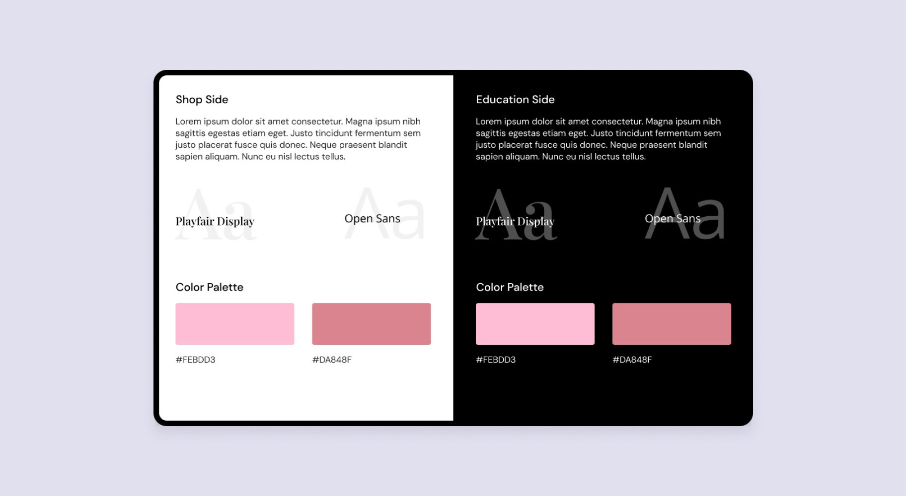
03 Establish Style Guidelines
With a few ideas in mind, I started whiteboarding different color schemes, heading fonts, body fonts, and generally which direction would be most suited for our vision of Lash Up Pro.
In Figma, I created a Style Guideline file to keep the visual library in one place, allowing me to update the Figma library and components in a single location should any changes be needed.
04 Design Development
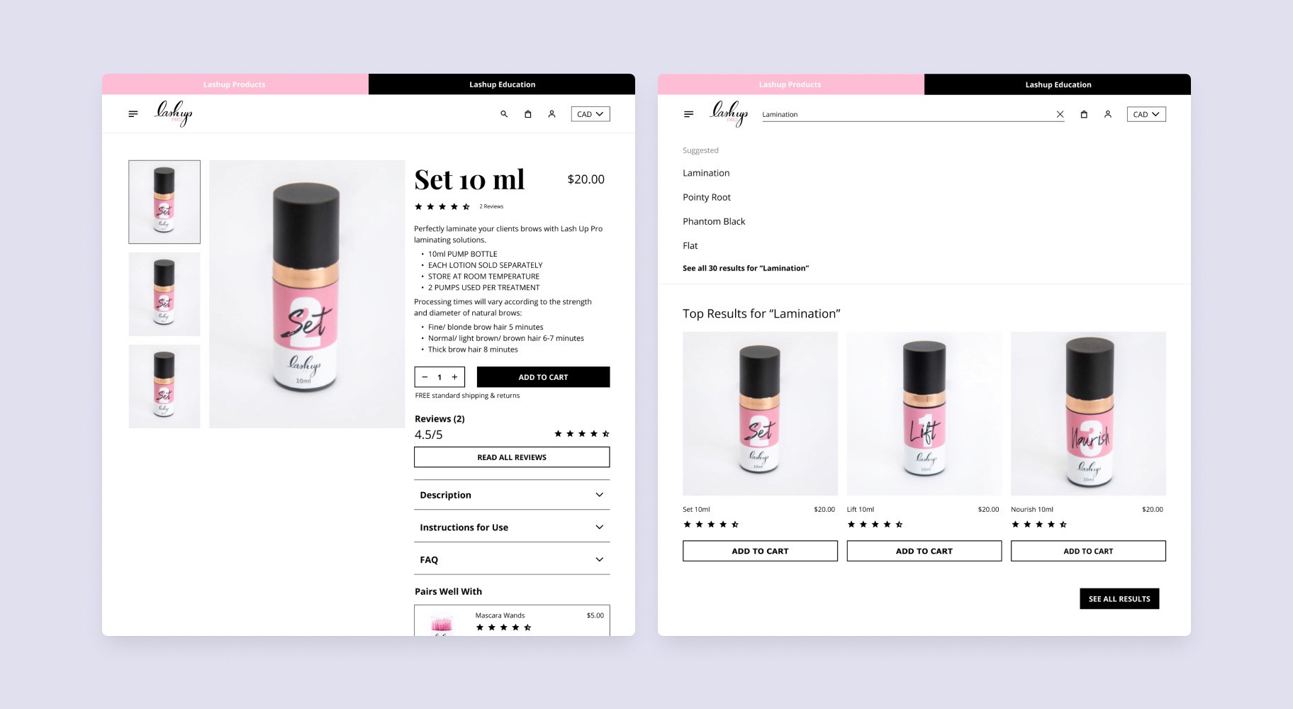
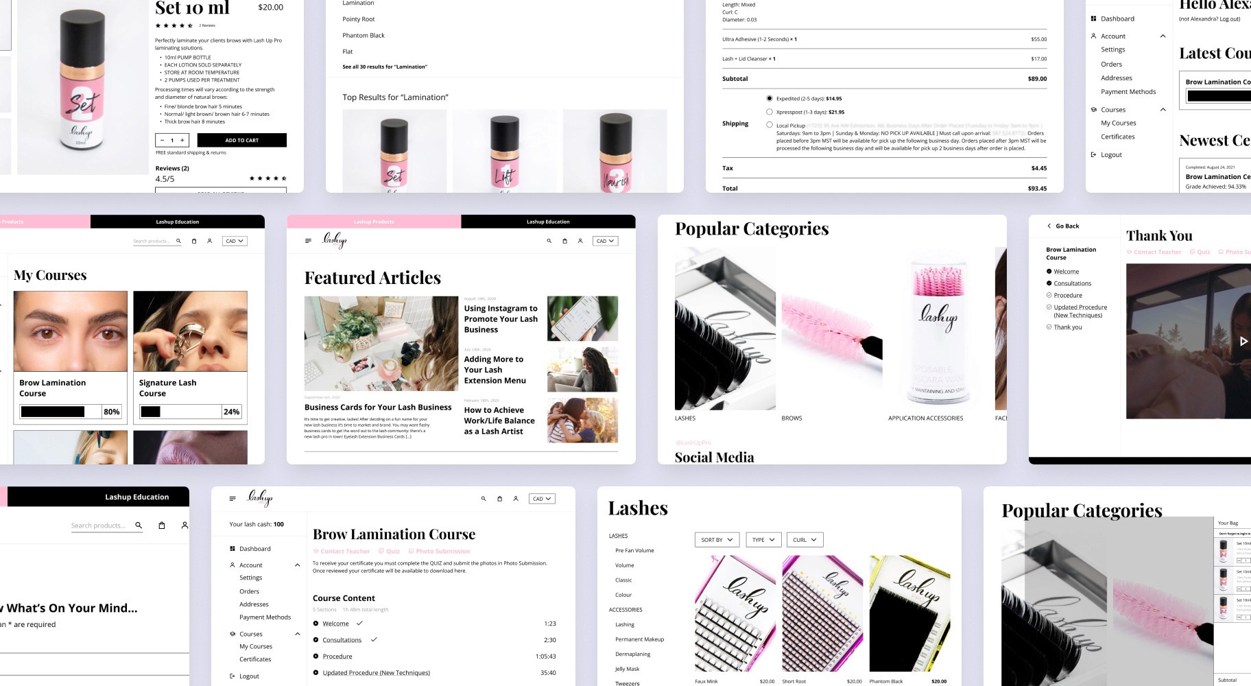
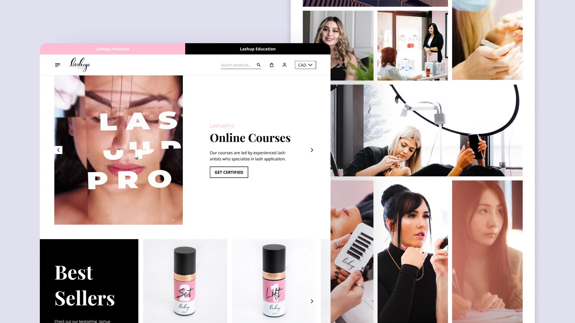
After we established some groundwork, I began the design process by developing the first homepage layout in desktop view. This allowed me to set the tone and style for the entire website while considering larger layout elements, such as the header menu, hero section, product slider, and more.
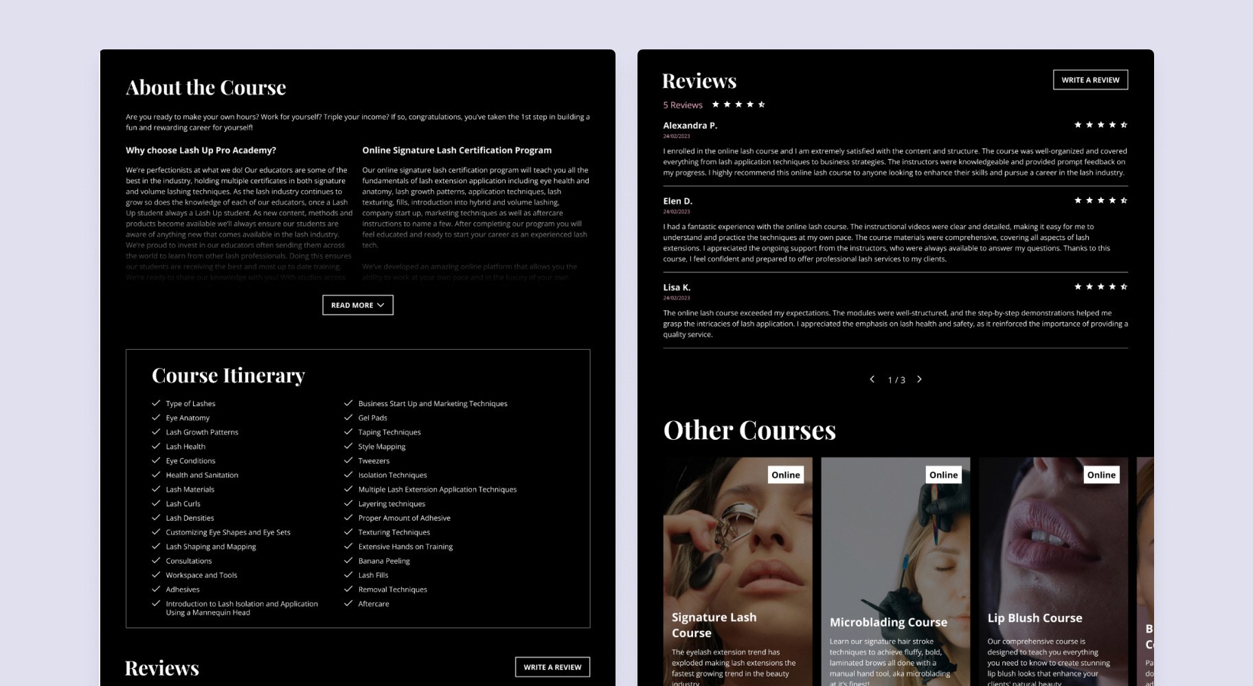
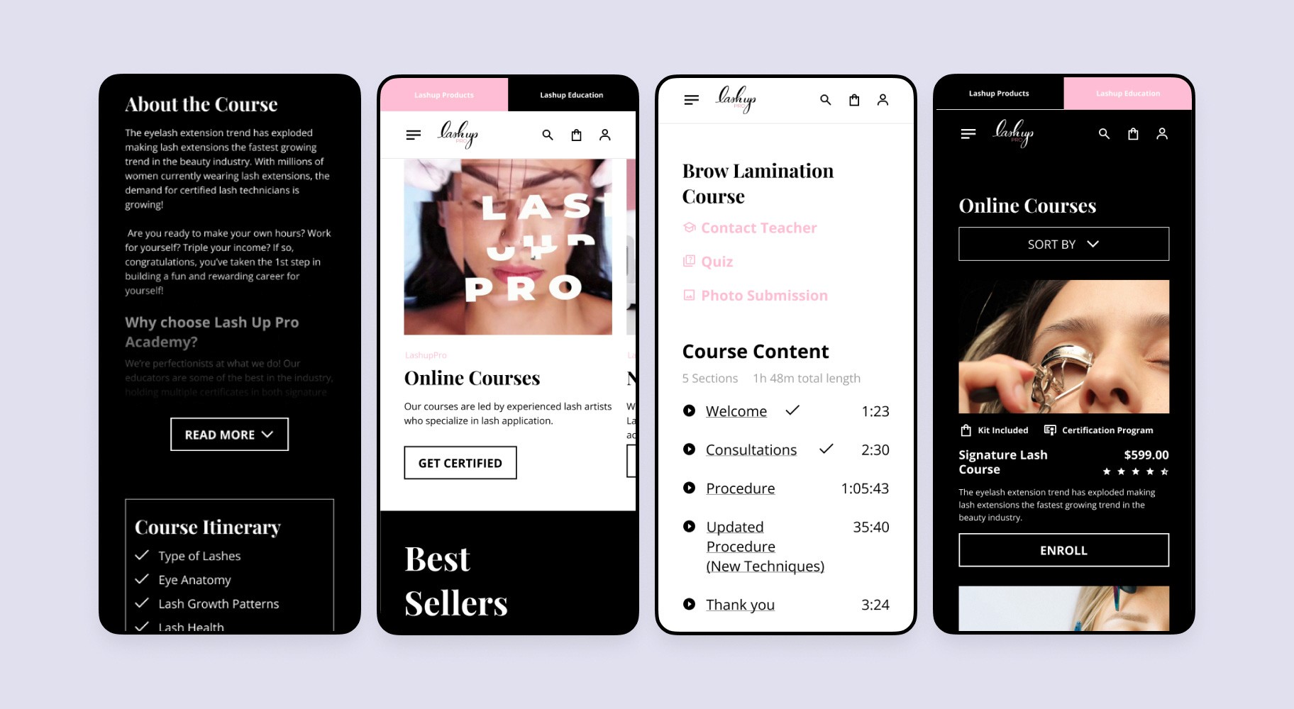
The site was supposed to have two modes: Light for the store and Dark for education. This added an additional challenge of maintaining design consistency and ensuring proper contrast on the opposite side.
05 Refine Details
Numerous adjustments were made, and we stayed in constant contact with the client. Implementing feedback was a crucial part of aligning the design with the realities of coding and the expectations of the client.
Visual Design
Some of the content from the old website still needed to be preserved due to its relevance and importance to the brand's messaging and SEO value. Rather than completely overhauling the site, we focused on modernizing the visual elements, ensuring that the design aligns with current industry trends and user expectations.
Education Part
As mentioned earlier, the website features two distinct modes — one for the store and another for the education section. Each mode serves a different purpose, making it essential for users to instantly recognize which part of the website they are navigating. To achieve this, we implemented a clear and intentional visual distinction between the two sections. The education section was designed with a white-on-black color scheme to provide a stark contrast from the store, which utilized a lighter, more vibrant palette.
Mobile Friendly
Here's an expanded version of that sentence:To ensure the design's functionality on smaller devices, I simultaneously created mobile visualizations throughout the design process to verify both its usability and visual appeal. This approach allowed me to anticipate potential issues early on, ensuring that the layout, typography, and interactive elements would seamlessly adapt to various screen sizes
Key Takeaways
The live website resulted in a $1,200 increase in sales during the first week. Additionally, we achieved a strong performance with a 92-point score in SEO optimization and 85 points for accessibility. I’m especially proud of the high level of consistency we maintained throughout the entire site.
This project was a great opportunity to better understand the rules of practical design, and I hope it won't be the last. If you are interested in my work, please feel free to explore my other projects or contact me. Thank you for taking the time to explore this case study.
Visit Lash Up Pro at: lashuppro.ca
